English Language Institute
Case Study
01. Overview
ELI Website Redesign is a real client project focused on improving the user experience while supporting the institute's business goals. Working closely with stakeholders, I conducted research to understand user needs better, evaluate the existing website, and identify opportunities to increase engagement, improve usability, and support future business growth.
Who is my stakeholder?
What are the needs of my user? ·
How can we imporve the user experience?
·
What values are important to my user?
·
Who is my stakeholder? What are the needs of my user? · How can we imporve the user experience? · What values are important to my user? ·
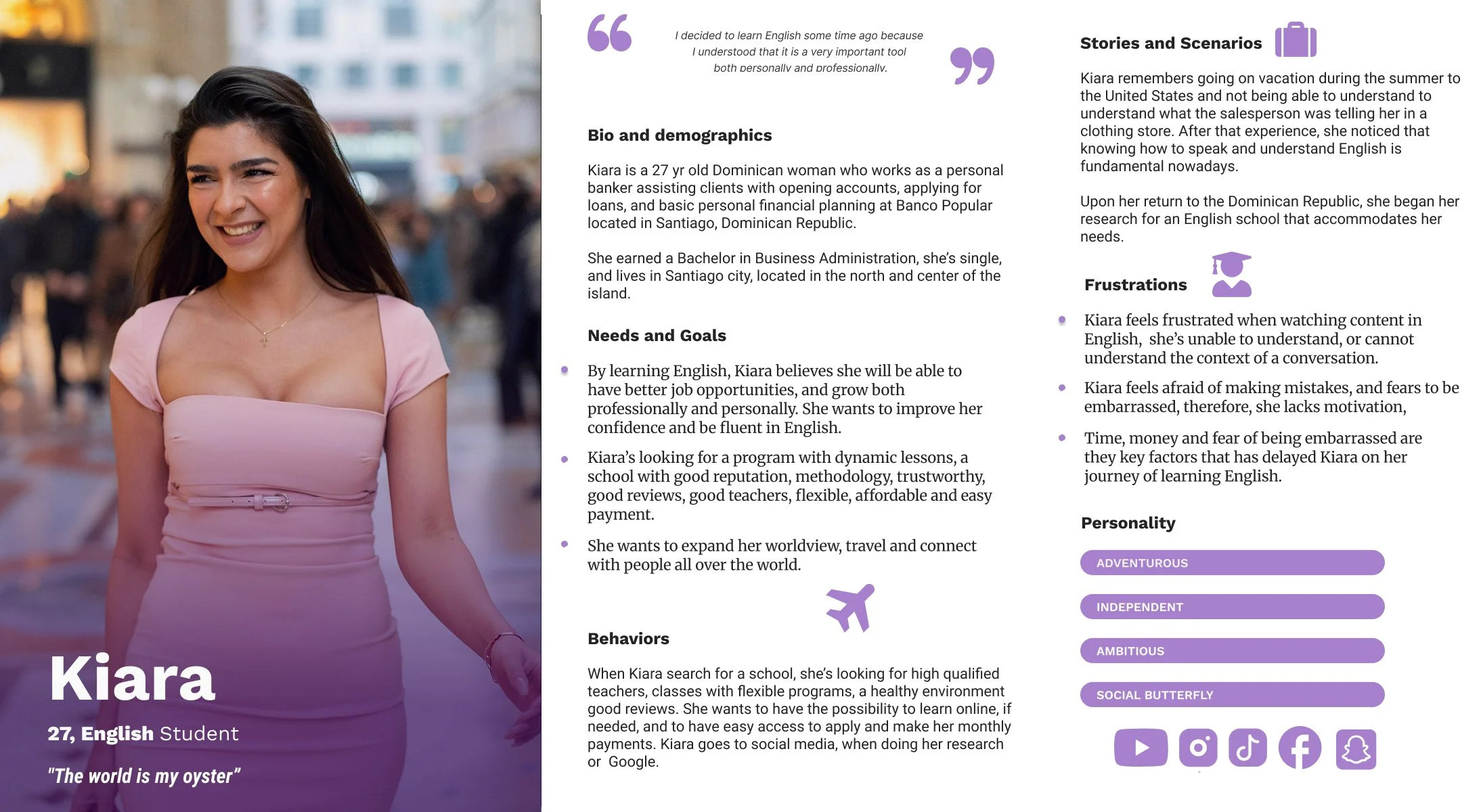
User Persona
-
User Behaviors
When Kiara search for a school, she’s looking for high qualified teachers, classes with flexible programs, a healthy environment good reviews. She wants to have the possibility to learn online, if needed, and to have easy access to apply and make her monthly payments. Kiara goes to social media, when doing her research or Google.
-
User Needs & Goals
By learning English, Kiara believes she will be able to have better job opportunities and grow both professionally and personally. She wants to improve her confidence and be fluent in English.
Kiara’s looking for a program with dynamic lessons, a school with a good reputation, a trustworthy methodology, good reviews, good teachers, flexible, affordable, and easy payment.
She wants to expand her worldview, travel, and connect with people all over the world. -
Users' Frustrations
Kiara feels frustrated when watching content in English; she’s unable to understand or cannot understand the context of a conversation.
Kiara feels afraid of making mistakes and fears being embarrassed; therefore, she lacks motivation.
Time, money, and fear of being embarrassed are the key factors that have delayed Kiara on her journey of learning English.
02. Problem
Kiara wants to be able to learn English in a judgment-free zone, so she can feel comfortable making mistakes and eventually reach a level of fluency that allows her to thrive personally in her friendships, her confidence, and open new doors of opportunity professionally.
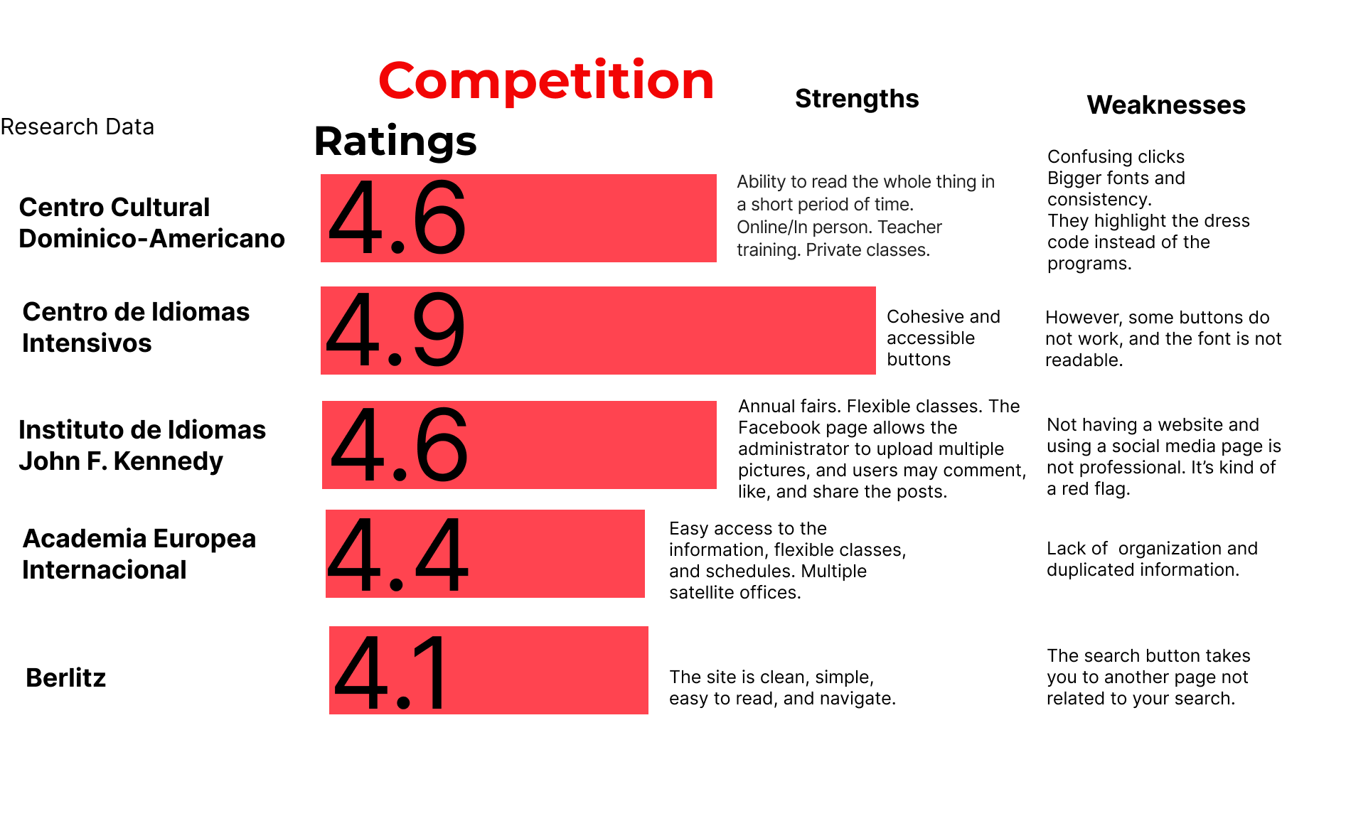
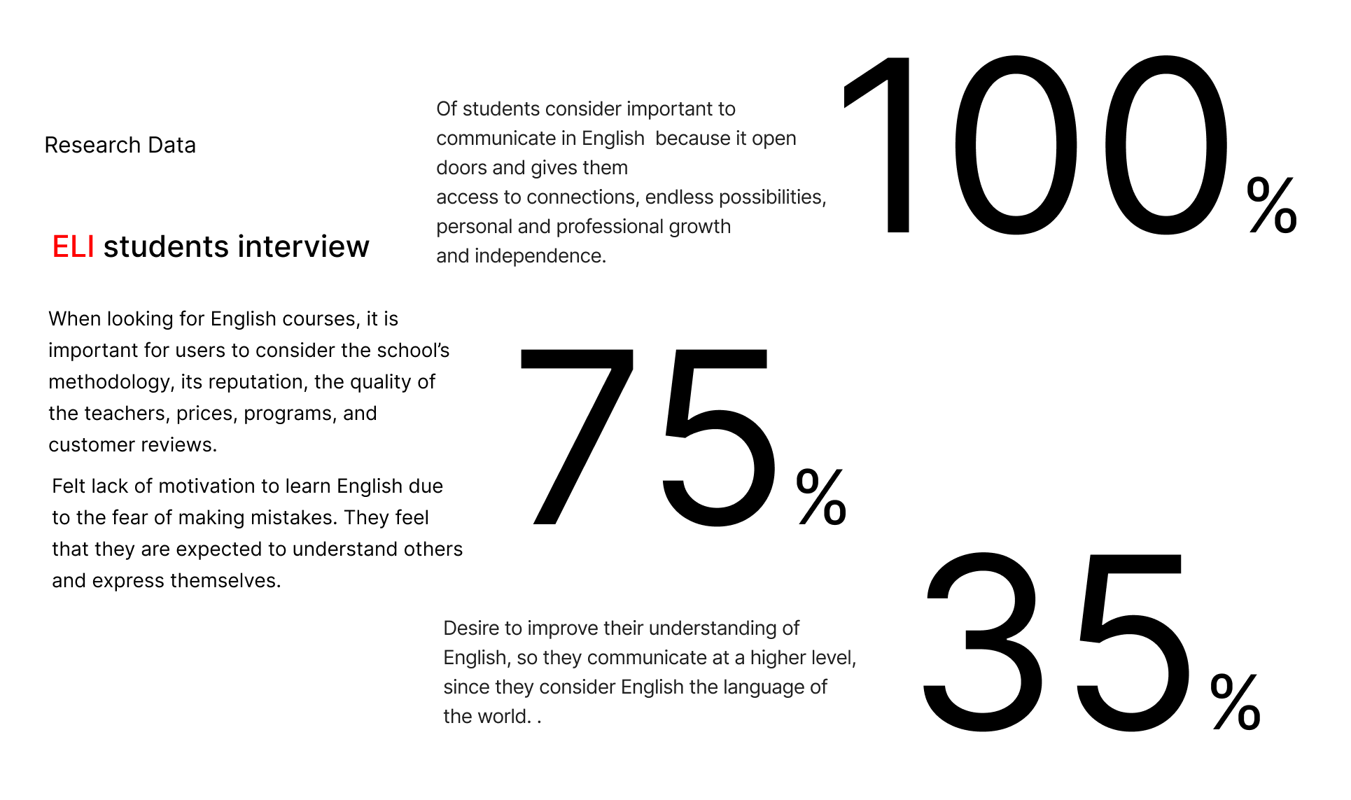
Usability Test
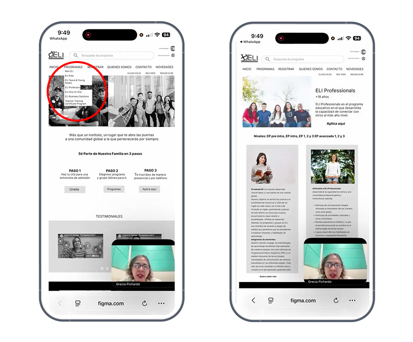
On the first round of the usability test of the actual website, it took Carlos 11 minutes to find ELI Professionals.
The other 2 students were searching for the word ELI Professionals. When they noticed “Programs,” they clicked, and when they opened it, they found that it was Mini ELI, a children’s program, and one student clicked back
Based on these findings, I designed a drop-down in the menu.
03. Design Process
Current website
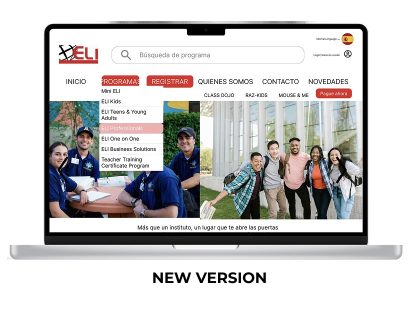
On the second round, I made the drop-down section more visible and highlighted it. The register button was also highlighted. During this usability test, the users also avoided multiple steps, and just clicking on the drop-down and selecting the class would take the user to the right page, instead of scrolling non-stop.
Click the screen to see the prototype
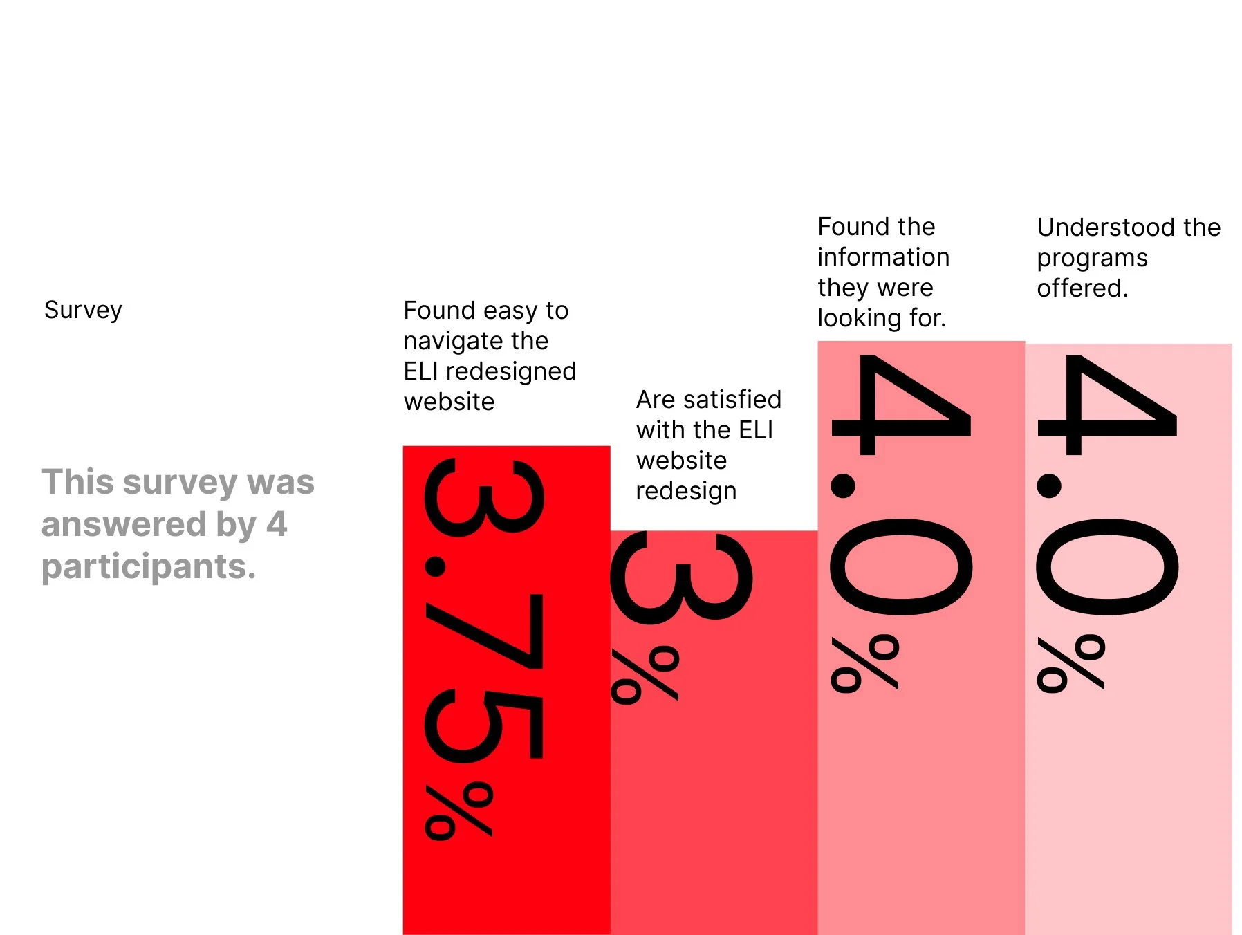
04. Solution & Results